Increasing NRE mobile journey planner conversions by £300k
3rd March 2019

National Rail Enquiries (NRE)


Summary
As lead UX Designer my role was to increase hand-offs for the m.nationalrail.co.uk website. Hand-offs are tracked by the amount of traffic sent off to other train company websites from the National Rail mobile site.
Problem
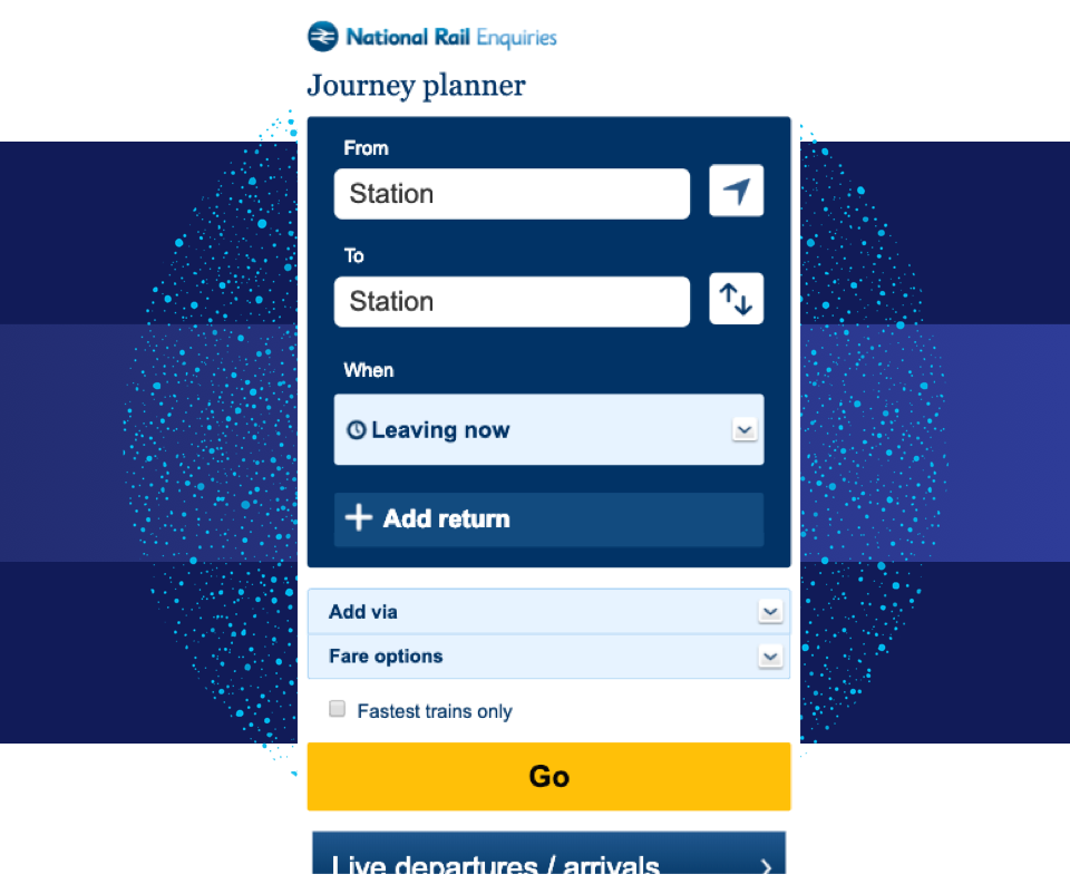
The mobile National Rail (NRE) site has a journey planner that is not finger-friendly for mobile devices. I suspected this could be turning users off from progressing to the results page to then hand-off to a train company.
Previous experiments introduced a number of modifications to make the journey planner more finger-friendly, but we saw no clear improvements. This new test will look at refining the design to improve overall hand-offs.
Solution
The previous tests ran multiple changes to the journey planner at the same time, preventing an understanding of the effects of specific modifications. Using a multivariable test should provide granularity to determine which individual changes can increase hand-off rates.
With this test, we modified the field size, field labels, the placement of the fare options, and the format of the departure field. Increasing the form field size led to a +1.88% increase in hand-offs. Moving the “From/To” labels into the station picker fields also showed promise.
Overall the winning creative has a potential value in extra conversions of £333,000 (additional hand-off revenue per year based on £40 Average Order Value).