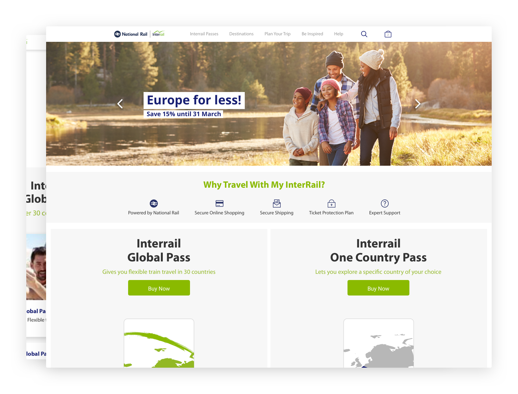
Redesigning My Interrail for £650k+ increase in conversions year on year
7th January 2019

National Rail Enquiries (NRE)


My Role:
I was the lead designer on the project, responsible for redesigning the whole website to be responsive and modern.
I worked with a development agency to bring my ideas to life.
The Problem:
The myinterrail.co.uk website design had not been updated for over 4 years, which in modern days, made it feel untrustworthy.
Having the National Rail brand logo across the website was not enough to deter users away from thinking the site was a phishing site. That coupled with Interrail being a seasonal product, only added fuel to the idea that someone whipped up a website to steal user details.
The site had a very high bounce rate with more than 40% of users who landed on the website going elsewhere after a few moments and a high exit rate of over 25%. A clear indication of a lack of trust.
Alongside this, My Interrail faces tough competition from other sellers of the Interrail product, eating away at its profits. Despite being the largest retailer of the product in the UK, competitors' responsive and modern websites instilled trust in users wanting to purchase from them.
The site also faced a huge information architecture problem with users not finding the right information and a heap of pages that no longer had any use.
I was strapped for time on this project and how much we could spend to redesign the site, so it could only be a re-skinning of the existing site. No new features and slight improvements to the purchasing flow of the website.
My Solution:
The first step was to review the information architecture (IA) and strip away what was not needed and remove confusion. Most of the pages that cluttered the IA were what we classified as "blog" pages and created a blog section to house those content.
We went from having lengthy sidebars and dropdown menus to one menu bar with all the content easily accessible from there or a search bar component.